This project is NDA protected so some information has been excluded.

RBC's Direct Investing Home Page is becoming outdated and could benefit from a redesign to remain competitive in the market
To redesign the Home Page to modernize the platform and bring new features that meet client needs.

We kicked off this project by conducting comprehensive research to understand the strengths and weaknesses of the current home page, along with the state of our competitors.
Google Analytics
Heuristic Evaluation
Competitive Audit
Usability Testing
Advisor Feedback Forum
User Surveys
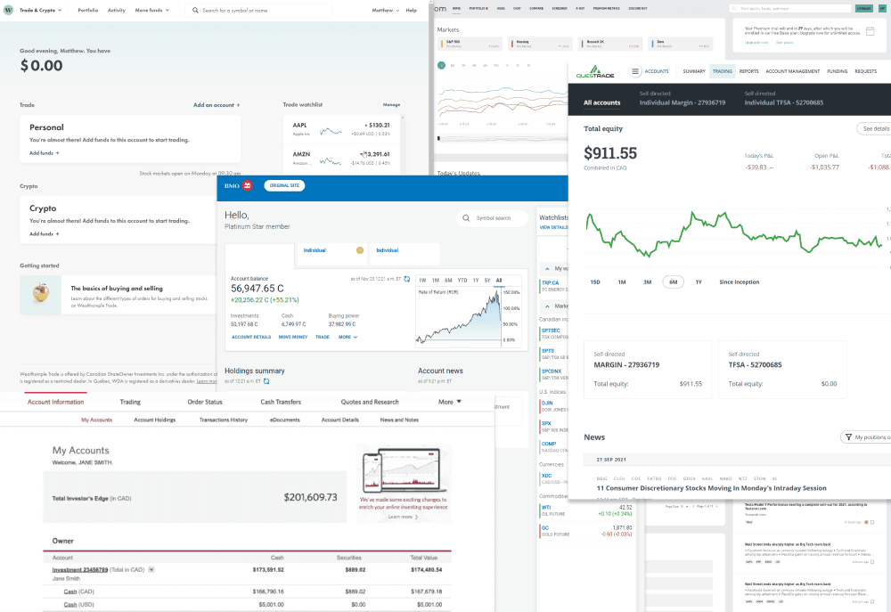
From the big banks to investment agencies, we looked at different investment interfaces to understand the competitive landscape
Usability Testing the Old Home Page
16 RBC Users
Unmoderated
Interviews
1
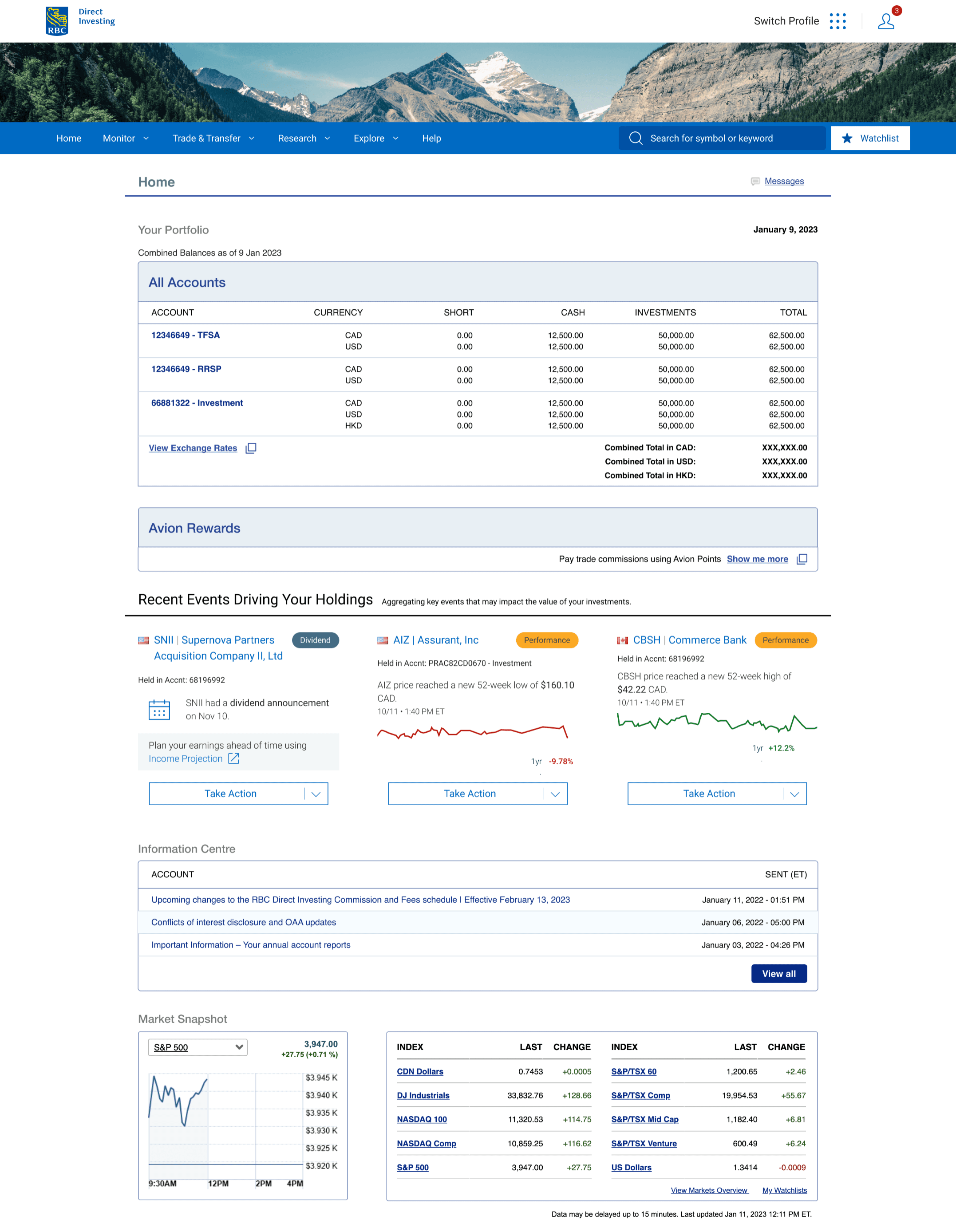
Poor Visual Appeal
An outdated look with too much white space.
2
Bad Order of Information
Market Indices are too low, and Avion rewards are too high.
3
Small Font
The text is hard to read and there is a lack of heirarchy.
900+ RBC Users
Unmoderated
Qualtrics
We worked with the research division to access survey data on feedback from current RBC Direct Investing clients.

Anonymous Client
"Looks like I'm thrown back 20 years in time!"

Anonymous Client
"There is no coordination between my direct investing account and my Home page."
Based on the research done in the discovery phase, we created a problem statement from the perspective of our users to create empathy and align the team toward a common goal.
Design Objectives
Next, we used our research findings to define how we plan to go about solving our problem statement.
Enable clients to easily understand portfolio performance
Provide clients with customization and personalization options
Improve the client journey thorugh task simplifacation
Showcase innovative features that clients can find value in
Feature List
For each of the four design objectives from the define phase, different features/capabilities were brainstormed and prioritized based on whether they should be part of MVP 1 or MVP 2.


Card Sort
20 RBC Users
Unmoderated
Optimal Workshop
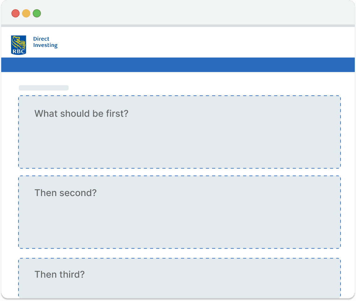
Next, we needed to figure out the order of features on the page before we started prototyping, so we conducted a card sort with 20 RBC Investors
Wireframing
Now that we knew what information users wanted to see first and last, I went ahead and began designing different versions of the interface based on the four main design objectives. Since the home page will be responsive, I designed in mobile first so that it would be easier to scale up the design for larger screens.

A/B Testing
10 RBC Users
Moderated
Usabilitytesting.com
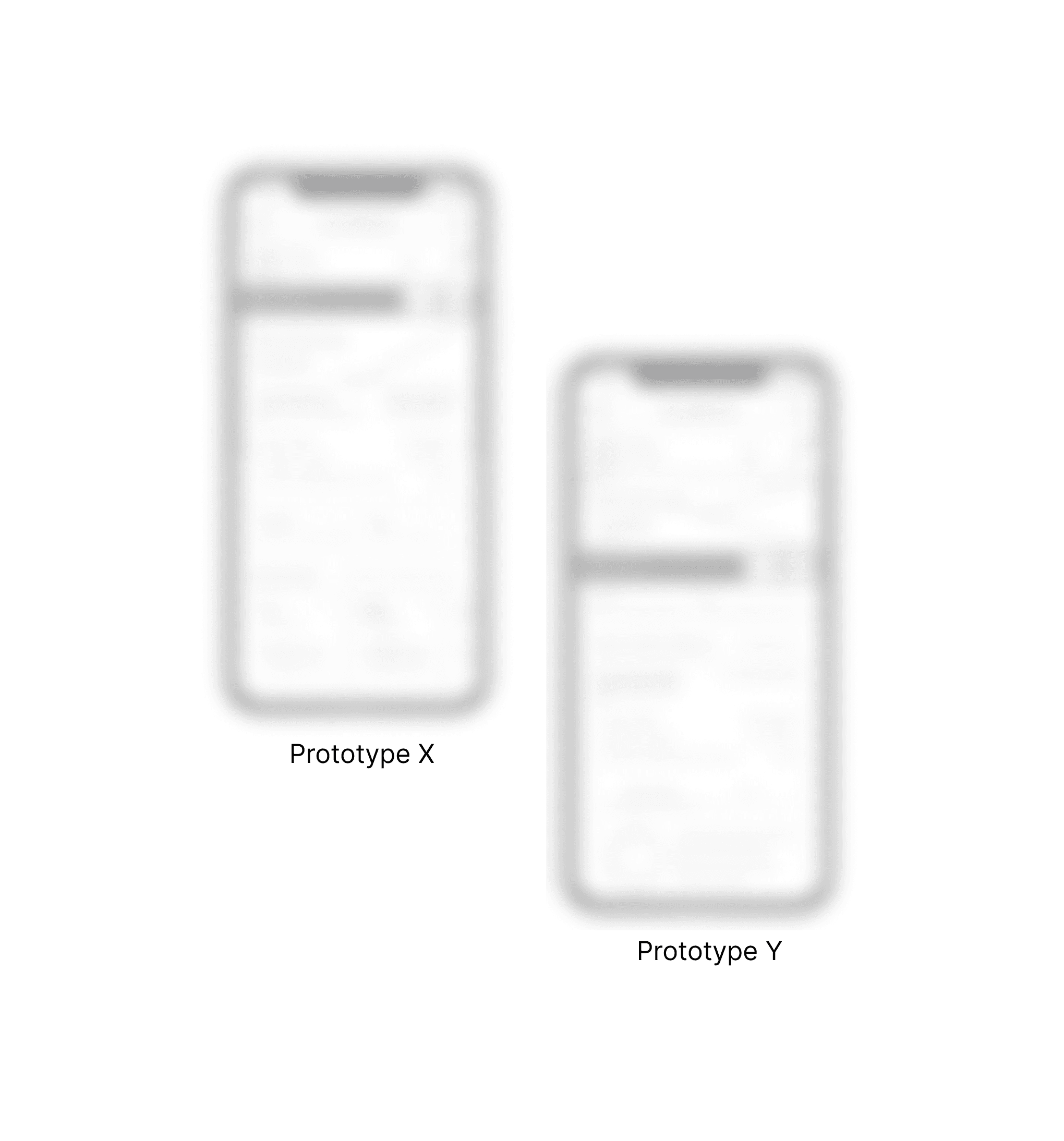
The team narrowed it down to two promising designs, and conducted A/B testing to figure out which one was preferred by users. Prototype Y was the clear winner.
Hi-fi Prototypes
I scaled up Prototype Y, designing it responsively in high-fidelity using RBC’s design system components and breakpoints.

Usability Testing
To ensure that the features are well-received and that the design is user-friendly, I’m currently in the process of conducting what will likely be the final usability test.
Why
To Evaluate:
Users’ tasks success rate
Clarity and comprehension
Layout and aesthetics
How
Moderated testing with users so that detailed qualitative data can be collected using an interactive prototype
Who
6 users, 3 of which are not existing clients
half will be novice investors, and half will be knowledgeable investtors
More to come soon!
Once the project goes live this case study will be updated with all the details