
The Chartered Institute of Marketing Management of Ontario (CIMMO) is a non-profit group that began in 1982. Their goal is to improve Canada’s professional marketing field by offering membership programs, professional designations, and continuing education courses. I was tasked with redesigning the website for prospective members in order to convert more site visitors into registered members.
My role
Lead Product Designer
Team
Myself + 2 other designs
Duration
2 months
The Challenge
CIMMO aims to reach 500 members by 2025, but they suffer from low conversion and high bounce rates despite having over 30,000 visits in 2022. I was tasked with redesigning the website for prospective members in order to convert more site visitors into registered members.
The Result
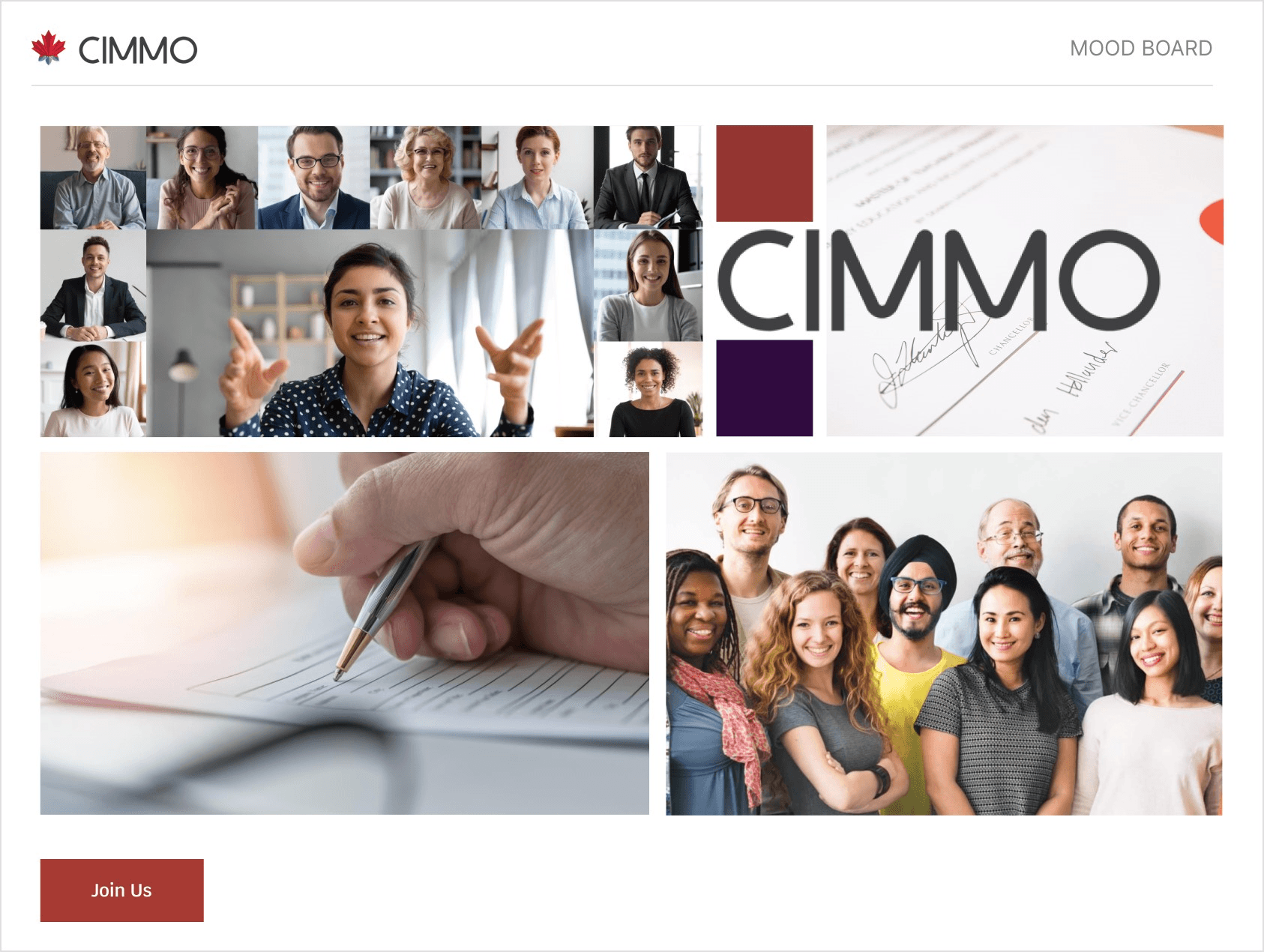
Refreshed Branding
A strong brand identity to meet CIMMO's desired image as an established institution.
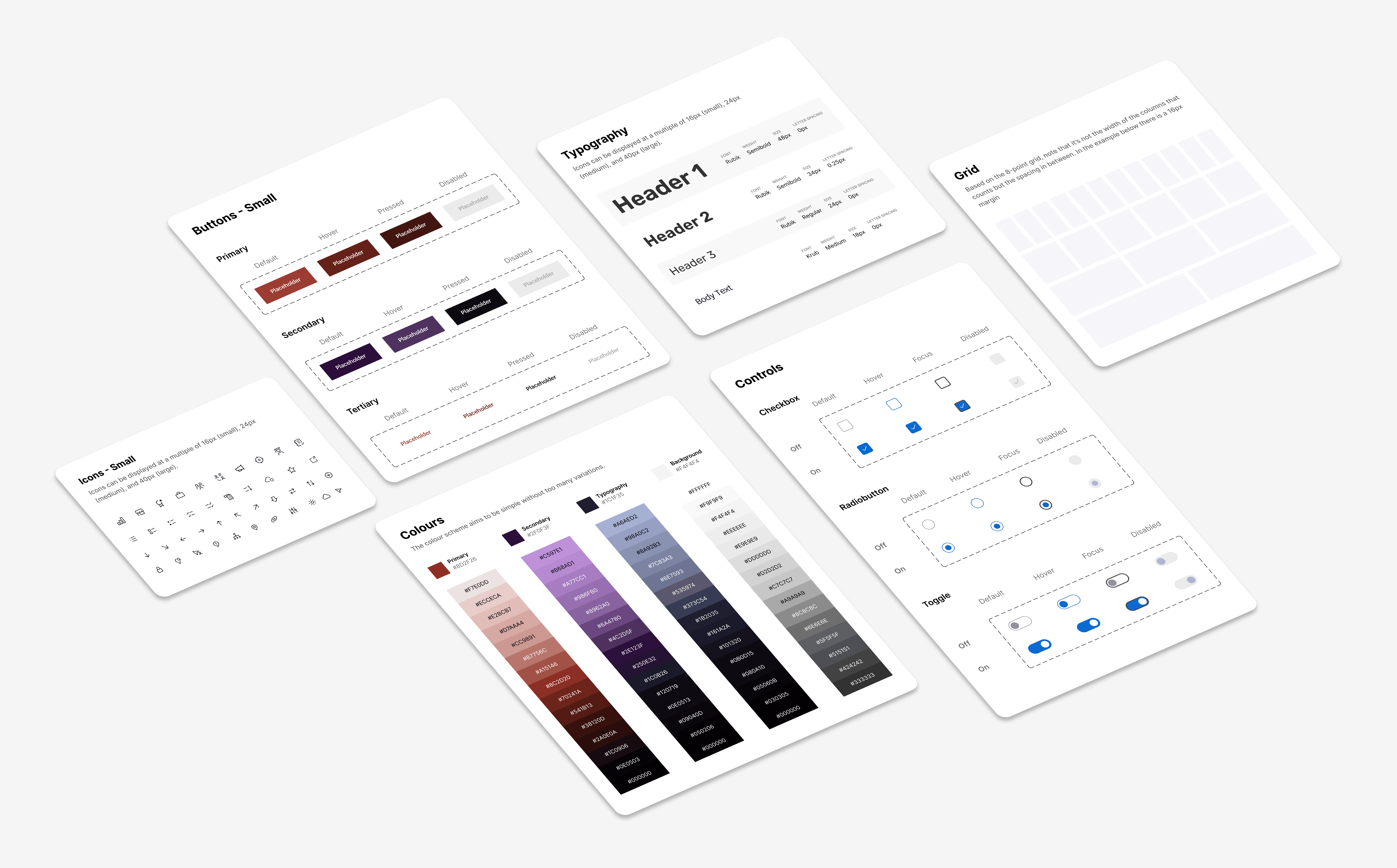
A Scalable Design System
Creating a reusable system of colours, shapes, and typography to create consistency and accelerate development speed.
A Clear & Intuitive UI
A focus on simple, clean designs with minimal content to make it easy to browse and understand.

"The team did a fantastic job. Working with them was a pleasure"
- CIMMO President

The Process
Identifying issues with the existing site
We kicked off the project by conducting research to identify existing issues with the website, starting with a heuristic evaluation. Over 90 violations were found, the majority of which fell into these three categories:

Overwhelming Content
Heavy jargon
Lengthy text
Poor information hierarchy

Inconsistent Design
Shifting fonts and colours
Irrelevant photos and icons
Unclear brand image

Accessibility Infractions
Inadequate colour contrast
Lack of text tagging
Small font
Mapping pain points in their journey
Our team created an experience map that details the before and after states for becoming a CIMMO Member. This scenario was selected because CIMMO wishes to grow its membership base, and the process of becoming a member proved to be problematic during usability testing.

Brainstorming Solutions
Based on the pain points flagged in the experience map, we brainstormed potential solutions. We narrowed down ideas by clustering similar themes and voting on them based on feasibility and impact. In the end, we had the time to implement each idea category below:

Mid-Fidelity Prototype
We created quick wireframes to visualize the ideas from our brainstorming session.

Usability Testing
To verify if we were on the right track, we conducted 9 moderated usability tests with our target audience of marketing students. Below are some key improvements made based on the feedback:

Before
Users found it difficult to quickly understand the eligibility criteria to apply for designations.

After
We used concise content and visuals so that users could quickly and easily understand the eligibility criteria.

Before
Users found it difficult to easily see the differences between membership plans.

After
We added a clear, side-by-side comparison of different membership plans
The Final Product

Key Learnings
Document Scope
Formally document the scope to align the team towards a common goal, prevent scope creep, and ensure stakeholder alignment.
Test when in doubt
Stakeholder Workshops
Collaborative stakeholder workshops are a fantastic way to kick off projects and document key information.