


RBC's Direct Investing Home Page is becoming outdated and could benefit from a redesign to remain competitive in the market.
A Home Page redesign to modernize the platform and bring new features that meet evolving client needs.

These ratings were gathered during high-fidelity prototype tests with six diverse investors, who unanimously preferred the RBC Home Page Design over their current platforms.
10
6
4
1
1
3
10
2
Discover
Define
Problem statement
Objectives and KPIs
Ideate
Brainstorm Solutions
Prioritize Ideas
Prototype
Test
To gain a deeper understanding of user needs, we conducted…
User Interviews & Surveys
Engaged with investment clients to gather insights on pain points and expectations.
Competitive Analysis
Studied competitor platforms to benchmark industry best practices.
Usability Testing
Observed real users interacting with the existing interface to identify friction points.
Advisor feedback forum
Collaborated with financial advisors to incorporate expert insights on client behaviors and needs.

Outdated look
“Looks like I’m thrown back 20 years in time!”

No investment graph
“I want to be able to see a graph of how my investments are doing”

Poor order of information
“The important information is at the bottom of the screen.”
Based on the research done in the discovery phase, we created a problem statement from the perspective of our users to create empathy and align the team toward a common goal.
Based on our research and the problem statement we created, we outlined 4 design objectives to orient ourselves towards.
Enable clients to easily understand the status of their investments
Provide clients with customization and personalization options
Improve the client journey through task simplification
Showcase innovative features that clients can find value in
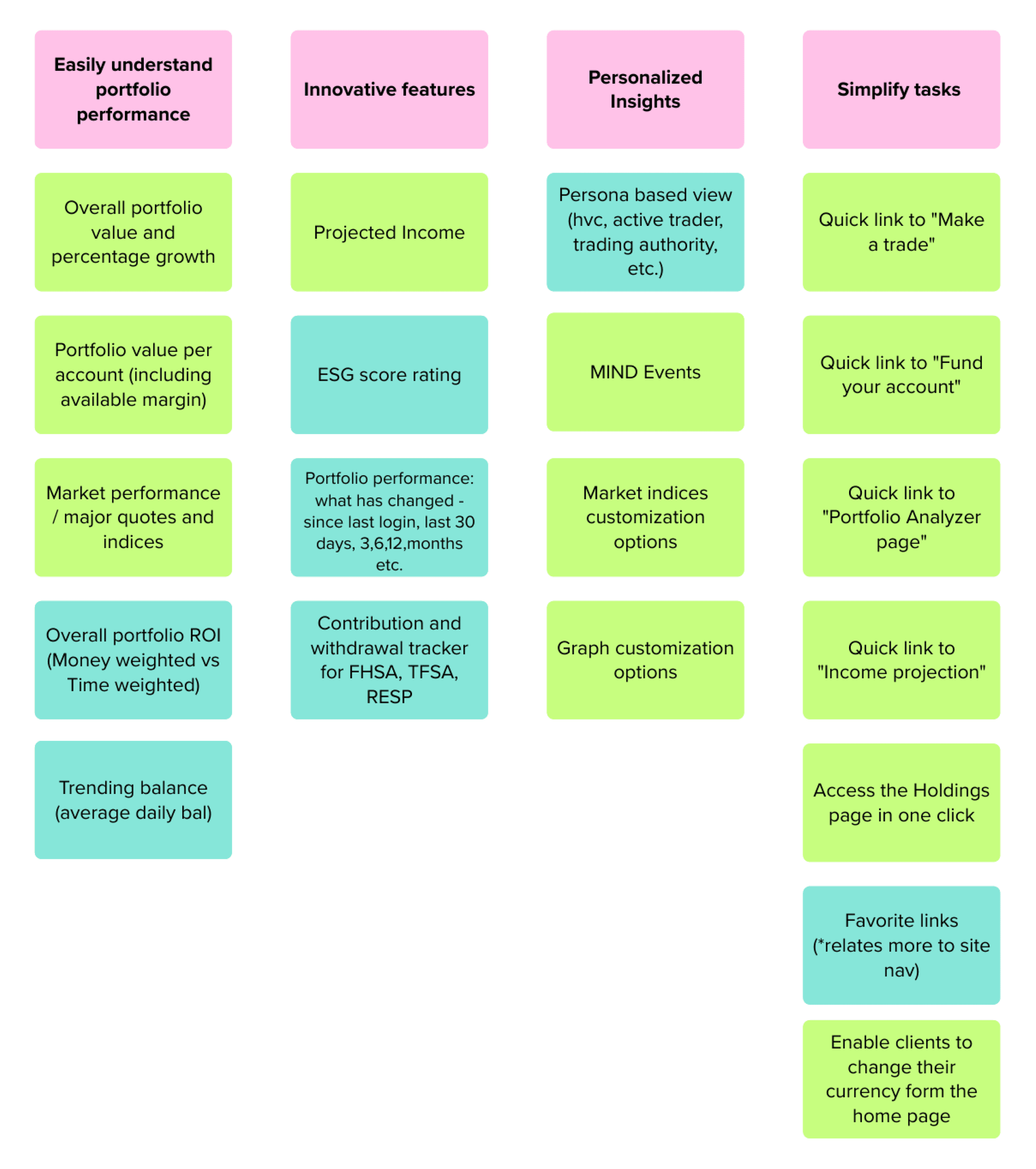
For each of the four design objectives that were outlined, different features were brainstormed and prioritized based on whether they should be part of MVP 1 or MVP 2.

20 RBC Users
Unmoderated
Optimal Workshop
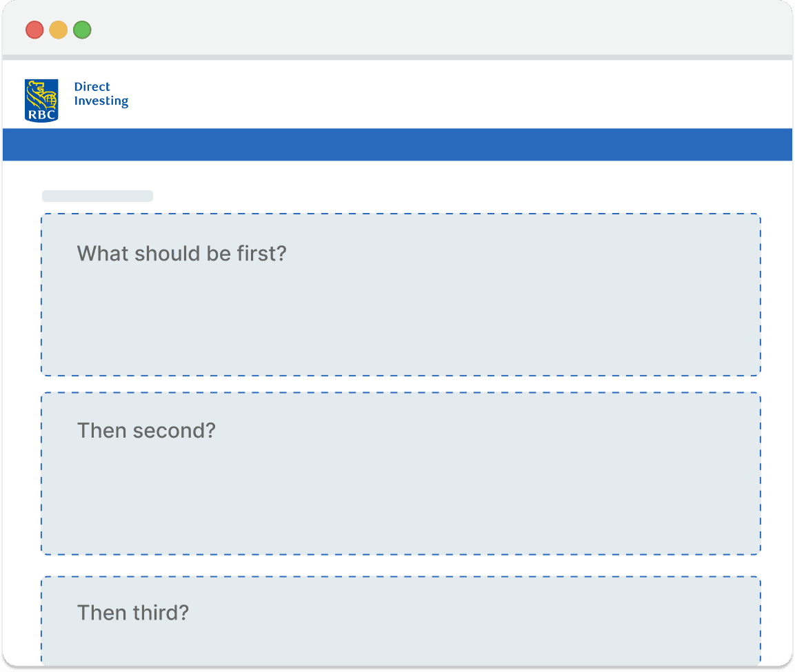
Now that we knew what features to include, we needed to figure out the best way to order them on the page. We learnt that account balance was the most important, while market news and investment articles was the least important.
10 RBC Users
Moderated
Usertesting.com
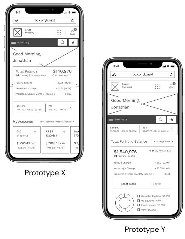
Equipped with our card sort learnings, I created two designs and conducted A/B testing to figure out which one was preferred by users. Prototype Y was the clear winner.
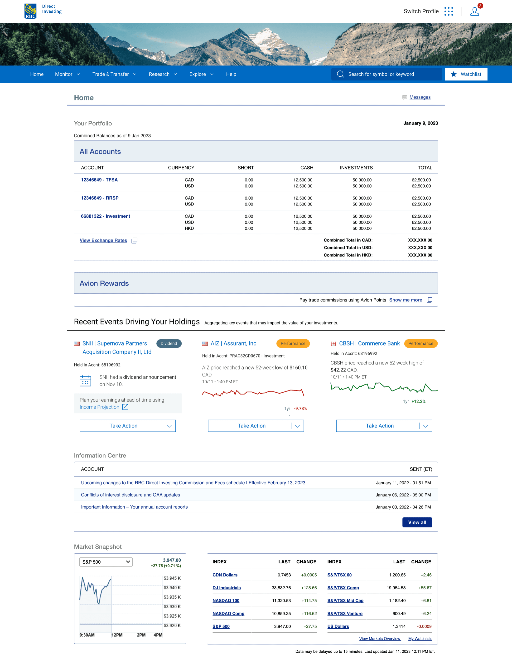
Based off of all the research insights and the corresponding design objectives, I crafted a user-centered redesign with the following features.
Design Objective #1
Enable clients to easily understand portfolio performance

Design Objective #2
Simplify tasks to reduce client effort

Design Objective #3
Provide clients with customization and personalization options

Design Objective #4
Showcase other innovative features that clients can find value in
Shifting Priorities
Continual project delays and deadline changes due to shifting organization priorities.
Conflicting User Feedback
Designing a globally used platform to meet the needs of everyone, from new investors to experienced ones.
Ample Constraints
Balancing design aspirations with technical feasibility and monetary restrictions.