


Usability Testing
9 Marketing students
6 tasks
45 Minutes
To account for issues not identified during our heuristic evaluation, we conducted a moderated usability test.
The two most important tasks driving CIMMO’s value proposition are where users struggled most:
3 / 9
Couldn’t figure out how to become a member
6 / 9
Couldn’t find designation information
Additional Issues:
Unclear company offerings
Information Overload
Poor Content Findability
Identifying Focus Areas
Based on the research findings, we identified the four areas that would provide the most value to work on:
Navigation Bar
Make the IA conform to mental models to reduce user frustration and abandonment
Home Page
Clarify the value proposition and offerings to engage users and reduce abandonment
Membership Page
Consolidate scattered membership information to increase member acquisition
Designation Pages
Provide details on the designation process to increase transparency and confidence
EMPATHIZE
003
Personas
Before brainstorming design solutions, we created personas with the help of our stakeholder to better empathize with and understand our target users. The two personas include a recent marketing graduate looking for networking opportunities, and a recent immigrant hoping to gain Canadian marketing designations.


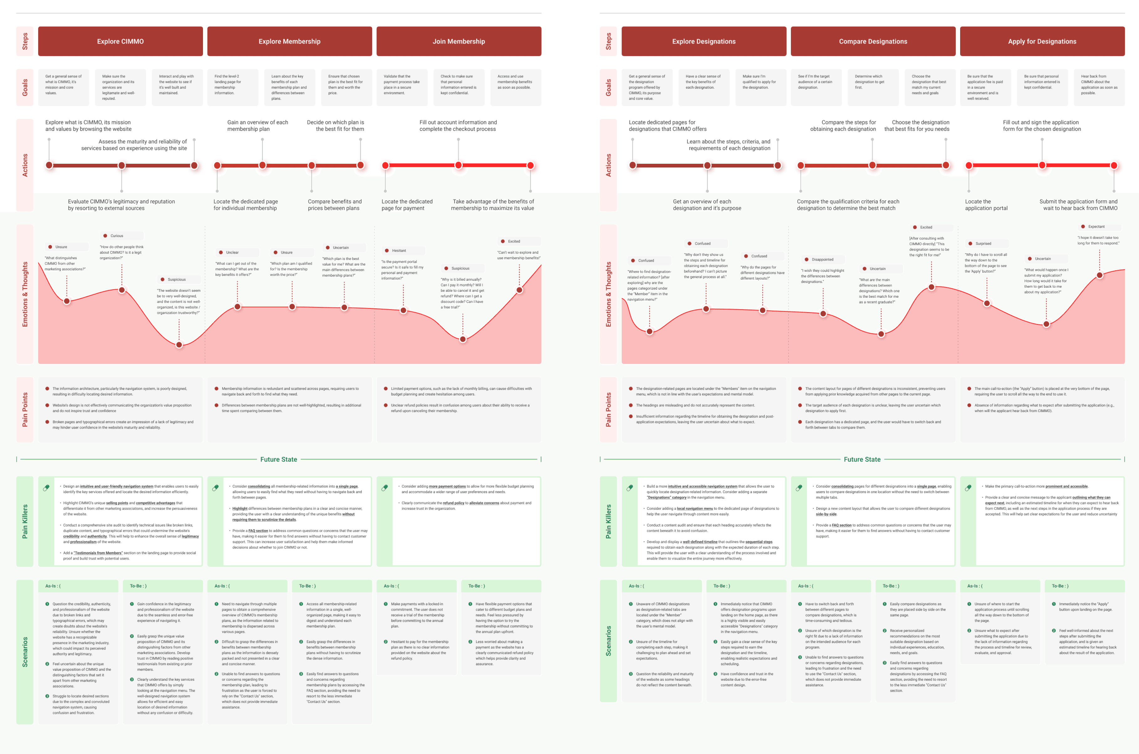
Journey Maps
From the perspective of our target audience, our team created two experience maps The maps detail the before and after states for two key scenarios that proved to be the most problamatic during usability testing.
Becoming a Member
Getting a Designation
Brainstorm
004
Brainstorming & Prioritization
Based on the pain points flagged in the experience map, we brainstormed potential solutions for the four problem areas outlined above. We narrowed down ideas by clustering similar themes and voting on them based on feasibility and impact

PROTOTYPE
005
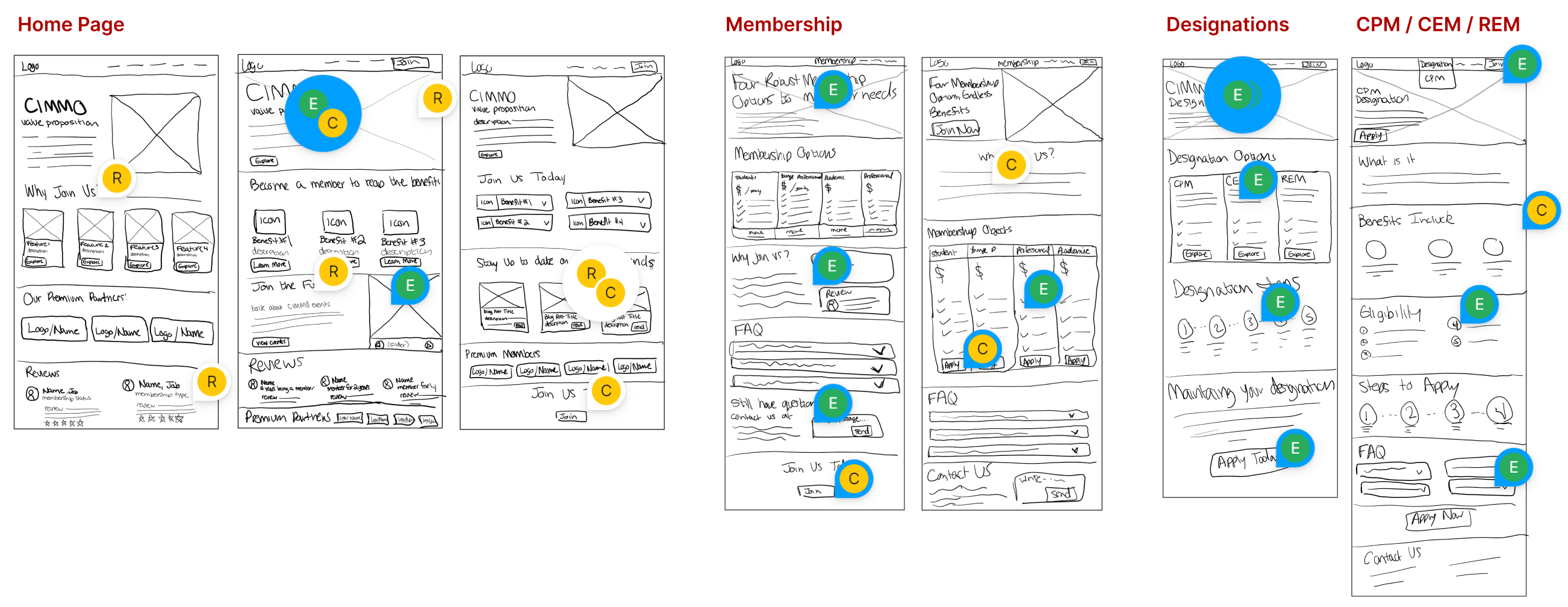
Lo-fidelity Prototype
Using a lean design methodology, we began by quickly sketching out potential concepts for the pages we were going to redesign. Team members reviewed the different versions and left comments with their feedback.
Mid-fidelity Prototype
After discussing the strengths and weakness of our lo-fi prototypes, we designed our mid-fi prototypes and conducted a usability test.
Mid-fidelity Usability Testing
9 Marketing students
6 Moderated tasks
45 Minutes
To verify if we were on the right track, we conducted usability tests with target users. Here were some key findings:
Reduce Content
There is lots of content on this page, maybe a little tiring to the eye - P9
Differentiate Membership Plans
I don’t really see any differences between the young professional and the professional plan - P7
Clarify Application Process
It wasn’t clear what I should prepare before start applying (e.g., my resume, proof of enrolment, etc.) - P2
FINAL PRODUCT
006
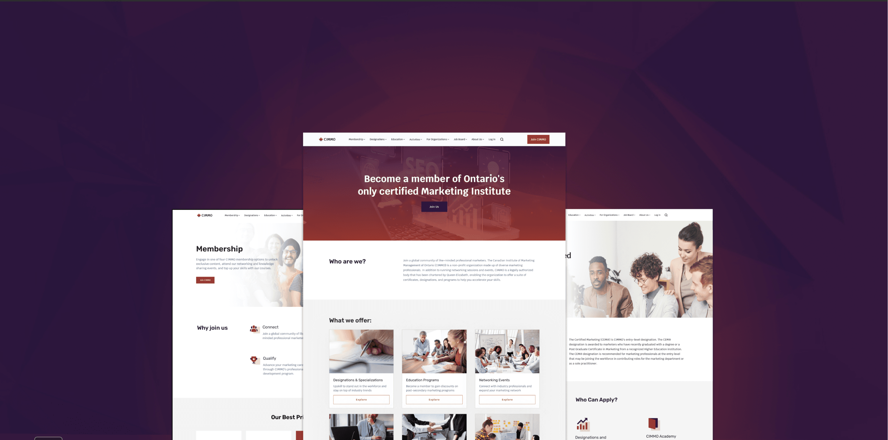
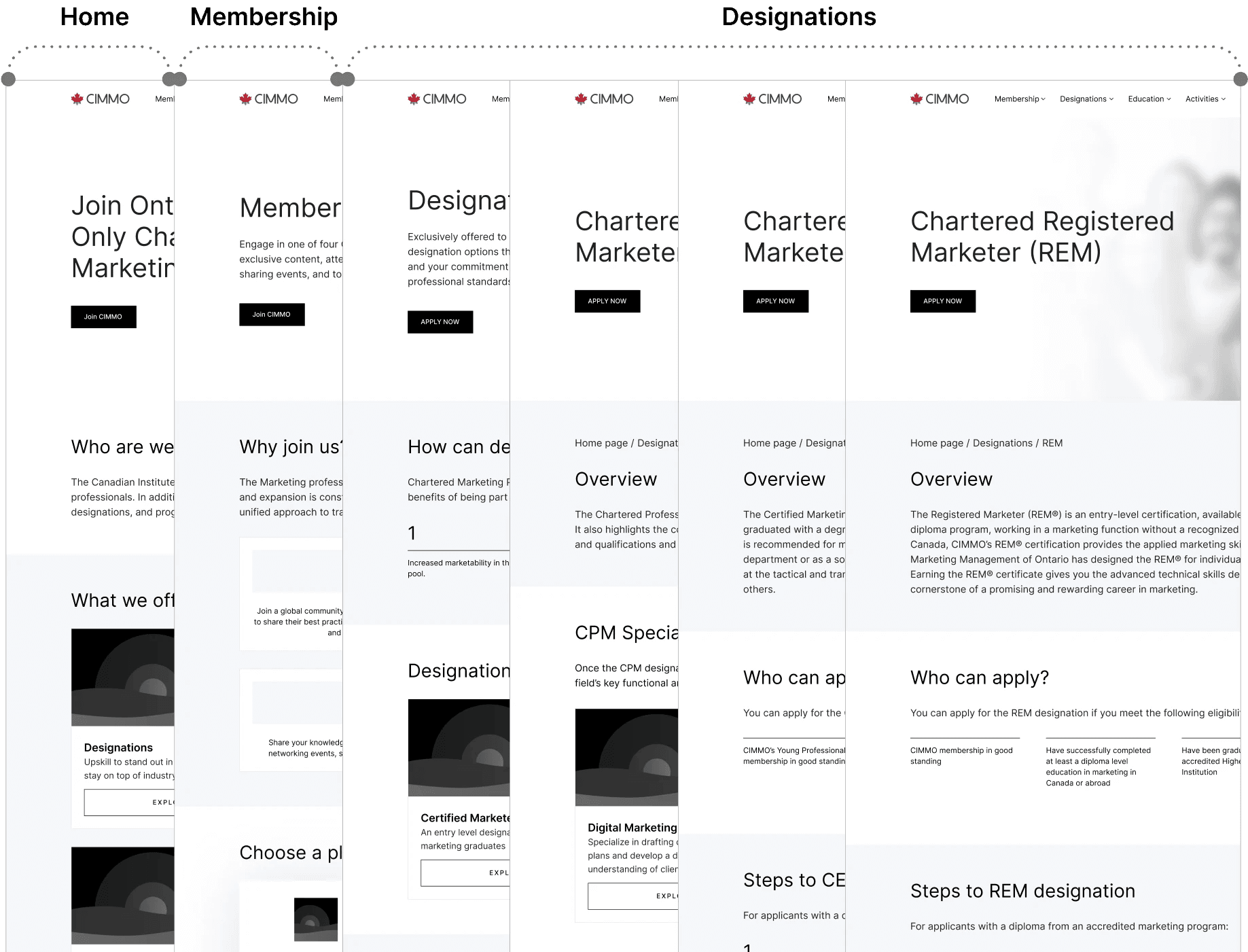
Home Page
Membership Page
Designation Page (1 of 4)
Key Metrics
Throughout each cycle of usability testing, we conducted a survey to ensure that we were improving in key areas that were flagged as pain points during our initial research. Below are the final results for our finished product:
96%
of users are very confident in their understanding of who CIMMO is and what they offer
90%
of users are very confident in their understanding of the steps to become a member and earn designations
100%
of users strongly agreed that the redesigned website appears professional and polished
+17 points
on the system usability scale compared to the original website, bringing it from okay to excellent (see graphic below).
System Usability Scale Results
50
0
100
40
60
10
70
20
80
Poor
Worst Imaginable
OK
Good
Best Imaginable
Excellent
90
30
50
0
100
40
60
10
70
20
80
Poor
Worst Imaginable
OK
Good
Best Imaginable
Excellent
90
30
50
0
100
40
60
10
70
20
80
Poor
Worst Imaginable
OK
Good
Best Imaginable
Excellent
90
30
69
78
50
0
100
40
60
10
70
20
80
Poor
Before
Mid-fi
86
High-fi
Worst Imaginable
OK
Good
Best Imaginable
Excellent
90
30
Lessons Learned
Formally document the scope to align the team towards a common goal, prevent scope-creep, and ensure stakeholder alignment.
When in doubt - test it. It’s a faster and more precise way to get answers when differing opinions arise.
Collaborative stakeholder workshops are a fantastic way to kick off projects and document key information.